
Skip to content
light bulb overlayed with a bar graph

On My Soapbox About “Accessibility”

As I've mentioned previously, researchers are often scared of the wrong things in research communication. I often talk about this issue in relation to the content, or "what," we communicate. Today, I wanted to talk about "how." Specifically, I want…
Read more
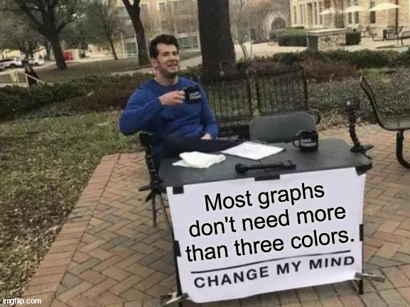
a man sitting at a table with a banner that reads Most graphs don't need more than three colors, change my mind.

Design and Conceptual Solutions for Color Accessibility

In last week's post, I meandered into the conclusion that, for color to be fully accessible in a data visualization, you shouldn't use more than three colors (light, medium, dark), including the background. But *so* many data visualizations have more…

Read more
Pie chart of the percentage of Lori's adulthood spent living in Virginia, Kentucky, Pennsylvania, and North Carolina. All pie wedges are shown in various shades of gray.

Dataviz Dilemma: Color Contrast

As science communicators, we want our messages to be accessible to all members of our target audience, regardless of differences in vision, hearing, physical ability, literacy, and other areas. Today, I wanted to share a visual accessibility issue I’m currently…

Read more
Back To Top