Lessons From My Grade School Writing
As I've mentioned previously, when I was a kid, I liked to write. Recently, I was reflecting on the quality and kinds of writing I did as a kid, and I realized that some lessons I learned back then that…

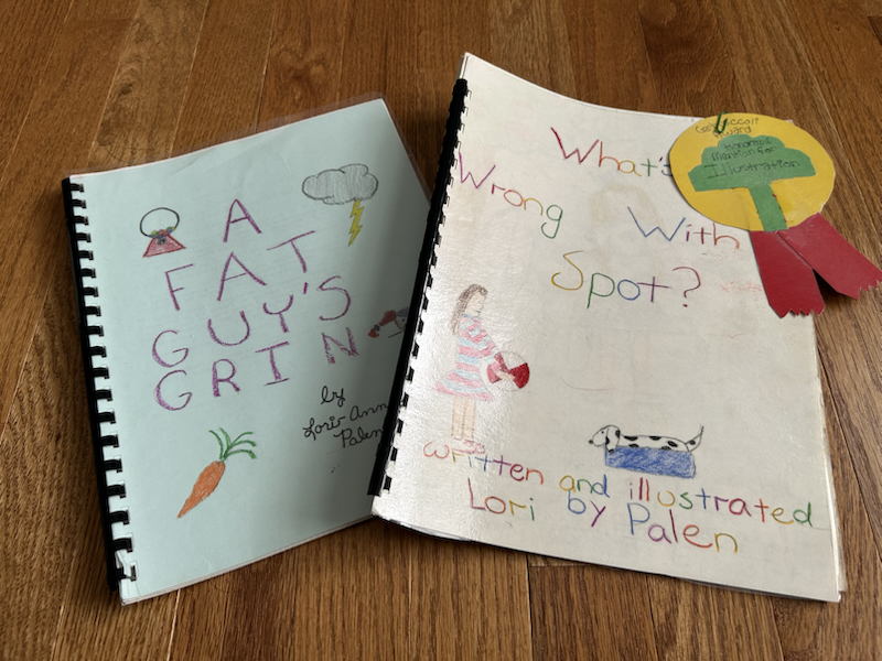
As I've mentioned previously, when I was a kid, I liked to write. Recently, I was reflecting on the quality and kinds of writing I did as a kid, and I realized that some lessons I learned back then that…
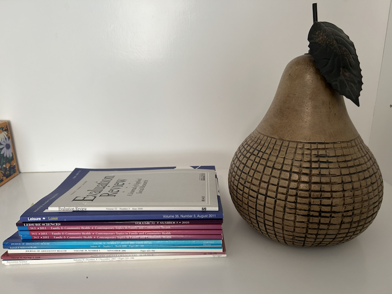
Recently, a colleague asked if I could provide examples of good data visualizations to share with an academic research center. Thanks to widespread education and evangelism, there are many good (or, at least, not terrible) examples of dataviz in modern…
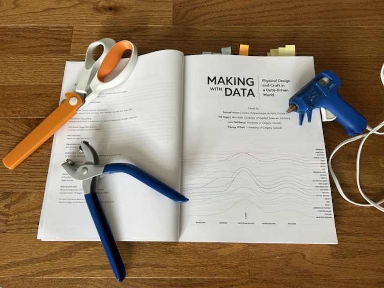
If you've been around Ye Olde Blog for a while, you may have seen me geek out about data art. So, when I heard about Making with Data (MWD), I had to check it out.* MWD features more than 25…

Last weekend, I was part of a career panel for ComSciCon-Triangle. ComSciCon is a nationwide workshop series organized by graduate students, for graduate students, focused on building science communication skills. It's super cool; I wish this had existed when I…

When I'm planning a new product with a client, one of the first things I try to get clear on is terminology. When someone wants me to develop a "dataviz" or an "infographic," what does that mean? And it's not…
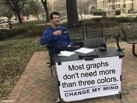
In last week's post, I meandered into the conclusion that, for color to be fully accessible in a data visualization, you shouldn't use more than three colors (light, medium, dark), including the background. But *so* many data visualizations have more…

As science communicators, we want our messages to be accessible to all members of our target audience, regardless of differences in vision, hearing, physical ability, literacy, and other areas. Today, I wanted to share a visual accessibility issue I’m currently…
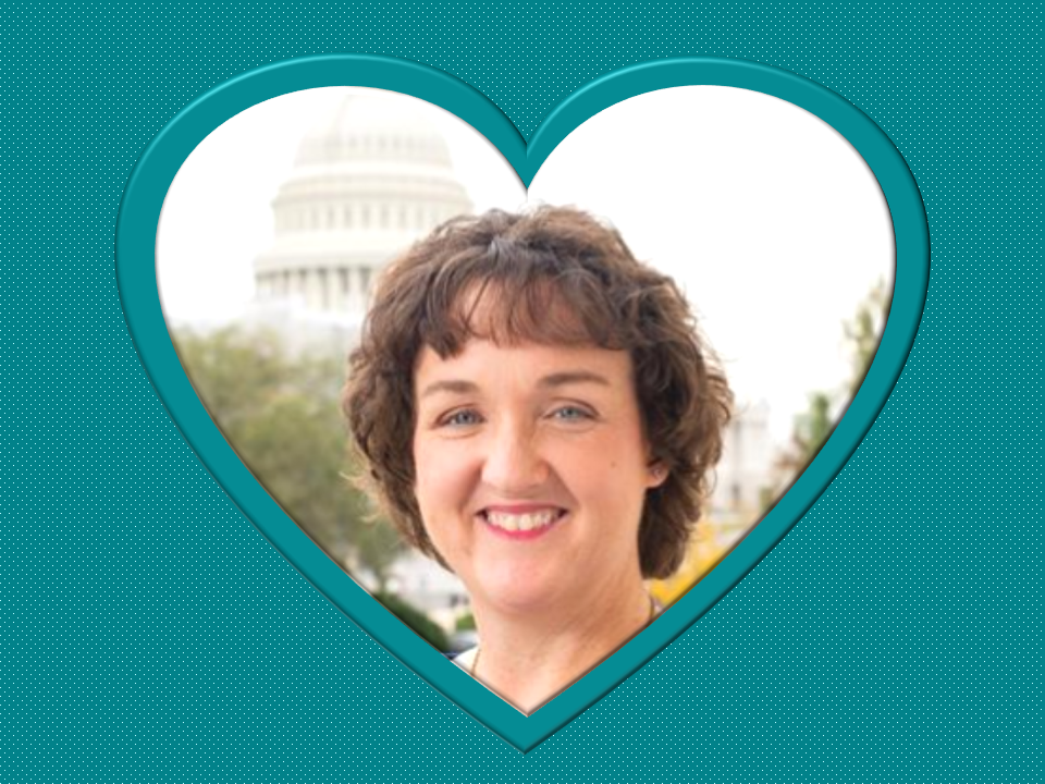
Sure, US Congressional representatives used visual aids before 2019.* But visuals are California Representative Katie Porter's claim to fame. Her whiteboard is immortalized in song, apparel, memes, and candles. In perusing Katie Porter's visuals, I realized that they are great…

This opinion is probably going to be unpopular, but here we go: Data visualization, or "dataviz," receives too much emphasis in research communication training and professional development. "Hypocrite!," you yell. "Wasn't the first research communication training you ever attended about…

Nightingale, the journal of The Data Visualization Society, recently published an interview with artist Lalena Fisher.* This February, Fisher, a former contributing graphics editor at the New York Times, published a picture book called Friends Beyond Measure. The book tells…