Skip to content
heart eye emoji and cover of Book from the Ground

Book Review: Book From the Ground—From Point to Point

Strictly speaking, Book From the Ground: From Point to Point (BFG) is unrelated to research communication. Loosey-goosey speaking, I learned about it in a work-related book (Joyful Infographics by Nigel Holmes) and I love icons, so [shrug], here we are…

Read more
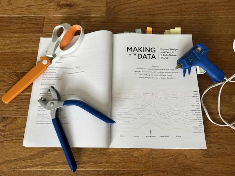
inside cover of Making with Data book, with scissors, pliers, and a glue gun on top

Book Review: Making with Data

If you've been around Ye Olde Blog for a while, you may have seen me geek out about data art. So, when I heard about Making with Data (MWD), I had to check it out.* MWD features more than 25…

Read more
com sci con logo, with a book, saturn, dna double helix, atom symbol, gear, and laboratory flask

SciComCon ’25 Recap

Last weekend, I was part of a career panel for ComSciCon-Triangle. ComSciCon is a nationwide workshop series organized by graduate students, for graduate students, focused on building science communication skills. It's super cool; I wish this had existed when I…

Read more
This is a photo of the cover of Flip Flop Fly Ball: An Infographic Baseball Adventure by Craig Robinson, with a Foreward by Rob Neyer, published by Bloomsbury. The cover has an outline of a baseball diamond, and on the pitcher's mound there is a pie chart showing that 43% of baseball books have a baseball on the ocver and 57% don't. The book is sitting next to a white New York Yankees baseball cap.

Book Review: Flip Flop Fly Ball

Sports geekery meets dataviz geekery in Flip Flop Fly Ball: An Infographic Baseball Adventure by artist and illustrator Craig Robinson. As a baseball fan and research communicator, this book has been on my To Read list for a while. I…

Read more
This is a panel of three paintings of floral bouquets.

Reflections on Two Memorable Job Talks

In academia, and in companies with academic leanings, there are events known as Job Talks.  A Job Talk is one component of job interviews for professors, researchers, and the like. In exchange for free food of varying quality, current employees…

Read more
This image says data visualization for, then an icon of a paint brush and palette, versus, then an icon of a head with gears for a brain.

Data Visualization for Art vs. Understanding

Every once in a while, a very small group gets overtaken by a big controversy. A couple of weeks ago, that very small group was data visualization professionals and enthusiasts, and the controversy was this: (The full New York Times…

Read more
This is the cover of the picture book The Great Graph Contest by Loreen Leedy.

Book Review: The Great Graph Contest

Is there an elementary school teacher on your holiday shopping list? If so, check out Loreen Leedy's The Great Graph Contest! This picture book features Gonk (a toad) and Beezy (a lizard) as they compete to create the best* graphs…

Read more
The presence of well-maintained trees is associated with less aggression, violence, and criminal activity in households and neighborhoods. Drawing of tree filled with hearts, smiley faces, and peace signs. Source: Turner-Skoff and Cavender, 2019, the benefits of trees for livable and sustainable communities. In the journal Plans, People, Planet, volume 1, pages 323 to 335.

Recap: SciArt September

Remember when I posted about my love for art supplies? Well, last month, artists Liz Butler and Glendon Mellow gave me a great excuse to use them and call it work: Often, science art focuses on the natural sciences. And…

Read more
This is the Data Soapbox logo made of round, fused Perler beads. There is a black speech bubble surrounding a vertical bar graph with ascending orange, green, and teal bars.

The Art of Data

In these pandemic times, like many people, I'm spending a lot less money on things like clothes, gas, and outings with family and friends. But you wanna know what I'm spending more money on? Arts and crafts supplies. Some of…

Read more
Back To Top